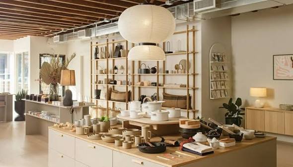
A store can hold a wide range of products and still feel simple to explore. That sense of ease comes from reducing the number of decisions a shopper has to make just to understand the space. When routes, categories and visual signals work together, attention can stay on the products instead of being spent on navigation.
Orientation comes before discovery
Shoppers need an early sense of where they are and what is available. That does not require a detailed map at the entrance. Clear sightlines, visible category areas and a strong main route can provide enough information to build a mental picture. A retail design agency often uses these broad spatial cues before adding smaller signs, because people understand places through what they can see as well as what they can read.
Choice works better in manageable groups
Large assortments can become tiring when every item seems to compete equally for attention. Grouping products into understandable families reduces that pressure. The shopper can first choose a category, then compare fewer options within it. This is a basic wayfinding principle, but it also affects merchandising. A display should show enough range to be useful without turning every surface into another decision point.
Visual hierarchy guides attention
People tend to notice contrast, scale and position before they process detailed information. Stronger lighting, larger graphics or a change in fixture height can signal an important zone. If every area uses the same intensity, however, the hierarchy disappears. A retail design agency can help decide which elements need emphasis and which should remain quieter, creating a rhythm that supports movement through the shop.
Routes should allow confidence and curiosity
An easy store is not necessarily a rigid one. Customers may want to head directly to a known category, browse several areas or return to something they noticed earlier. Good circulation supports all three behaviours. Main routes should be legible, while secondary paths can introduce more discovery. Dead ends and tight turns need careful handling because they can make shoppers feel they have made the wrong choice.
Landmarks reduce mental effort
Distinctive features help people remember where they have been. A feature table, material change, service desk or recognisable graphic can act as a landmark. These elements are useful when they support the structure of the space rather than simply adding decoration. A shopper who can think “the fitting rooms are beyond the timber display” has a more useful reference than someone trying to remember a sequence of aisle numbers.
Consistency makes signals believable
A navigation cue only works if it behaves consistently. If one colour represents a department in one area but becomes decorative elsewhere, its meaning weakens. The same applies to signs, fixture types and graphic styles. A retail design agency can build a limited visual language and repeat it carefully so customers learn what different signals mean as they move.
Information should arrive at the right moment
Too much information too early can make a simple choice feel complicated. Detailed product messages are most useful when customers have already reached the relevant category and are ready to compare. At a greater distance, broader cues such as department names or visual anchors usually work better. This layered approach means the store can communicate at different scales. A person can first decide where to go, then what to examine, and finally which details matter for a purchase without processing every message at once.
The psychology of easy exploration is therefore less about controlling people and more about reducing avoidable uncertainty. Shoppers stay oriented when the space gives them clear choices, recognisable landmarks and a sensible hierarchy of information. When those elements are coordinated, browsing can feel natural even in a complex store. The customer notices the products and the experience, while the navigation quietly does its work.