You’ve probably deleted an app within minutes of downloading it. Maybe it was slow. Maybe it was confusing. Maybe it looked like it came from 2009. The point is, we’ve all been there. So let’s flip the script.
If you’re building an app, or already have one out there, it has to be easy to use. That’s not a bonus. It’s the bare minimum. Whether you’re launching a fitness tracker, a language learning tool, a dating app, or an AI interview platform, the same rule applies: if your users don’t get it quickly, they’re gone.
Let’s break down why simplicity matters so much — and more importantly, how you can actually achieve it.
Why Simplicity Matters So Much
Users Have No Patience
Think of your own habits. How long do you stick around if an app doesn’t work the way you expect? One second too long to load, one too many taps to complete a task, and you’re out. People don’t have the time or interest to “figure out” your design choices. If it’s not intuitive, it’s forgotten.
Clarity = Trust
The simpler the app feels, the more professional it comes across. Users feel like they’re in good hands when everything is clear and predictable. On the flip side, if your app looks messy or functions poorly, it kills trust right away. They start wondering if you’re cutting corners elsewhere, too.
Less Confusion, More Action
If your app exists to get something done — whether it’s booking a ride, ordering lunch, or prepping for an interview — then every second of confusion delays that outcome. When users understand the next step instantly, they’re more likely to actually take it.
Common Signs Your App Isn’t Easy to Use
Sometimes it’s hard to admit your app might be confusing. But let’s be honest — if you see these red flags, there’s work to do:
- People sign up but don’t stick around
- You’re getting customer support questions that should be obvious
- Features you thought were great are being ignored
- Reviews mention “hard to use” or “confusing”
If you’re checking any of these boxes, you’ve got a usability problem. Good news is, you can fix it.
So… What Makes an App Easy to Use?
Let’s look at the key ingredients.
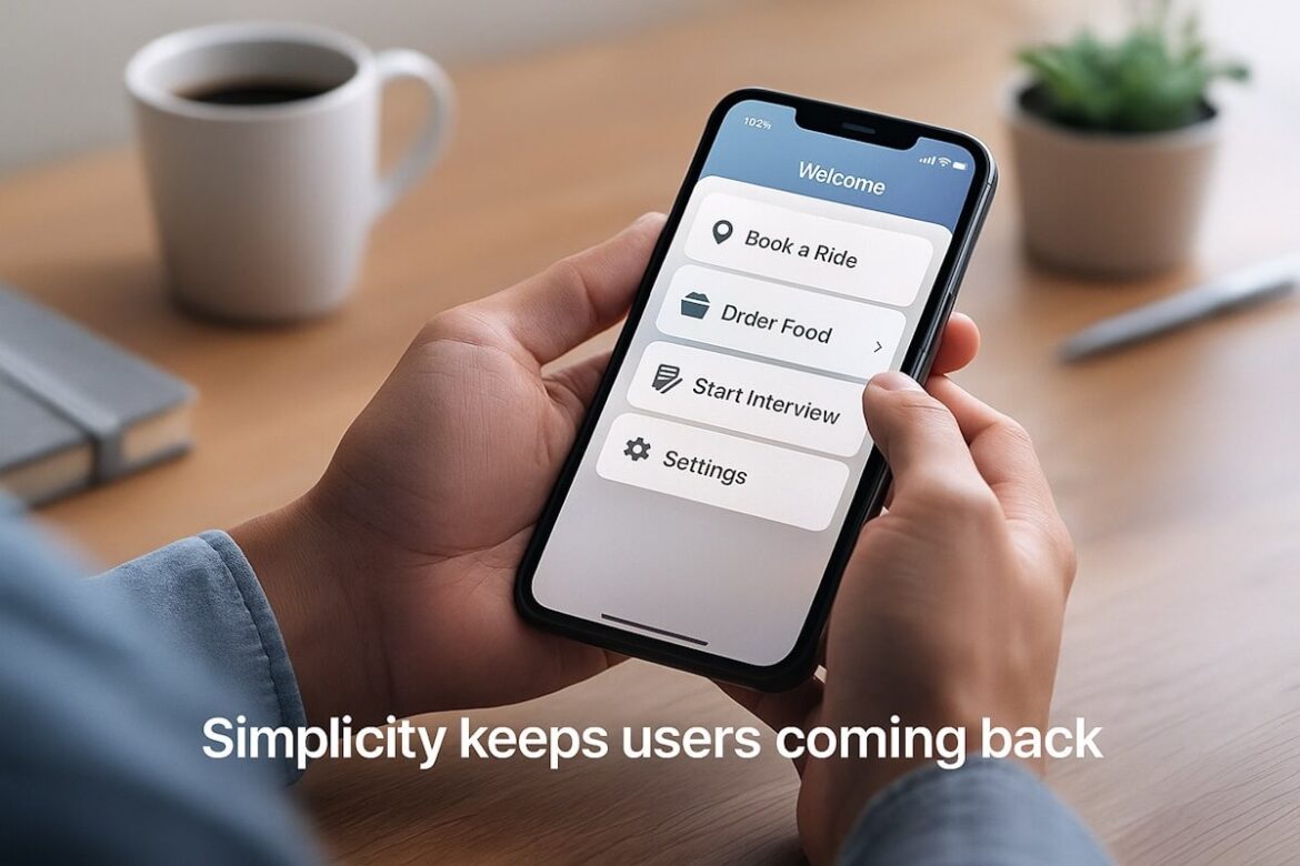
1. Clear Navigation
Your app should never feel like a maze. Users should always know:
- Where they are
- What they can do next
- How to go back
Menus should be simple. Icons should make sense. Avoid hiding important stuff behind multiple layers. If a user has to tap five times just to find their settings, that’s too much.
2. Clean, Simple Design
No one’s impressed by a crowded screen. Don’t throw too much at the user at once. Use white space. Stick to two or three fonts. Keep colors consistent. The design should support the content — not compete with it.
3. Short Learning Curve
The app should “teach” itself through design. Tooltips, walkthroughs, and animations can help — but the layout should be so intuitive that users don’t need much help to begin with. If they can figure it out without reading a guide, you’ve nailed it.
4. Fast Load Times
Speed isn’t just about convenience. It’s about keeping people engaged. Every second of delay increases the chances they’ll close the app. Keep your app lean. Use caching. Optimize images. Make performance a top priority.
5. Logical User Flow
Think about the end goal your user has. Now work backward. Every screen and button should get them closer to that goal, without detours. Don’t make users jump through hoops to finish a task. The fewer steps, the better.
How to Make Sure Your App Stays Simple
It’s one thing to design a clean app. It’s another to keep it that way. Here’s how to stay on track.
Test With Real People
Don’t guess what users want. Actually ask them. Sit down with people outside your team and watch how they interact with the app. Where do they hesitate? Where do they make mistakes? These moments are gold.
Even better, work with a Mobile App Development Company in USA that does user testing as part of the build process. They’ve already made the mistakes you’re trying to avoid — so they know what to look for.
Use Analytics
You can track how users behave inside your app. Where they drop off. What screens they spend time on. Which features they ignore. All of that tells you what’s working and what’s not.
It’s not just about the numbers either. Combine data with feedback. If 70% of users never complete your onboarding process, talk to some of them and find out why.
Keep Iterating
A simple app isn’t built once. You’ll need to keep tweaking. Every time you add a new feature, check how it impacts the rest of the app. Does it confuse users? Does it push other features too far down? Don’t let your app become a mess of half-finished ideas.
Don’t Try to Impress — Just Work
It’s easy to get caught up in bells and whistles. Fancy animations. Flashy colors. Weird transitions. But most users don’t care. They just want your app to work — smoothly and quickly.
Take a mobile app using chatgpt, for example. The best ones don’t bury the chatbot behind three menus. They put it front and center. Clear text input. Fast response. Instant help. Simple as that. No one’s asking for a sci-fi movie experience. They want answers.
Same thing with an AI interview platform. If a candidate can’t figure out how to start the interview, or if the UI is clunky, it damages the whole experience. And if you’re using AI to screen candidates, but the interface is confusing, you’ll lose talent before you even meet them.
Focus on Accessibility Too
Making your app usable for everyone is part of keeping it simple. That means:
- Good color contrast
- Big enough buttons
- Voiceover support
- Easy text resizing
If someone with limited vision or mobility can’t use your app, you’ve cut off a big chunk of your audience. And honestly, a more accessible app usually benefits everyone.
Keep the Content Clear
Words matter. Don’t use jargon. Avoid tech terms your users might not understand. Use plain English. Label buttons clearly. Write error messages that help people fix the issue, not make them panic.
If someone hits the wrong button, tell them what happened and how to undo it. Don’t throw a generic “error code 305” and expect them to know what that means.
Don’t Overload the First Experience
First impressions are everything. If your onboarding is ten screens long and includes a quiz, tutorial, and product tour… you’ve already lost most people. Get them to the core feature as fast as possible. Then explain the rest later, as needed.
You don’t have to show everything upfront. Guide users gradually. Let them explore at their own pace. Keep the welcome experience light and useful.
Think Like a User (Not a Developer)
This one’s tough, especially if you’re close to the product. You already know where everything is. You know what each icon does. But new users don’t.
Step back. Try your own app like it’s your first time. Better yet, watch your family use it. If your non-tech-savvy uncle can’t figure it out, there’s a good chance your users won’t either.
Working with a trusted Mobile App Development Company in USA can help here too. They bring an outsider’s perspective and can offer ideas that your internal team might miss.
Make Updates That Simplify, Not Just Add
Every new feature should earn its place. Ask yourself:
- Does this feature solve a real user problem?
- Will it clutter the interface?
- Can it be added without breaking the flow?
If the answer’s no, skip it. More features don’t always mean a better app. Sometimes they just mean more confusion.
Wrap-Up: Keep It Simple, Keep Them Coming Back
If people struggle to use your app, they’ll stop using it. It’s that simple. You don’t need a hundred features or flashy graphics. You need clear, useful design that makes people feel like they’re in control.
Want more users to stick around? Want better reviews, longer sessions, and more word-of-mouth growth? Then make your app simple, clean, and easy to use.And if you’re building something from scratch, whether it’s a health tracker, a mobile app using chatgpt, or a hiring tool like an AI interview platform, partner with people who get it. Start with the user, keep it simple, and let everything else follow.