Most Rooms Feel Off and Nobody Thinks to Blame the Ceiling
Furniture gets replaced. Walls get repainted. Cushions get swapped out with the seasons. And through all of it, the ceiling light stays exactly as it was — same shade, same tone, same quality of light falling over a room that has changed completely beneath it. People will spend hours choosing a rug and not give a single thought to whether the light above their head is working with the room or quietly working against it. The colour of that light — not the bulb, but the shade filtering it — has an enormous effect on how a space feels. Getting it wrong does not ruin a room. It just makes a room slightly less than it should be, every single evening, without anyone being able to pinpoint why.
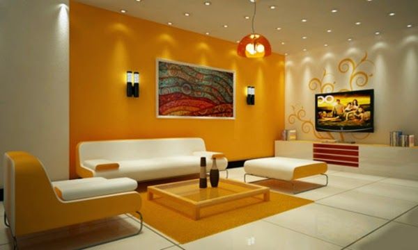
What Blue Does to a Room That No Other Colour Quite Manages
It is not blue because it would be the most obvious option as overhead lighting, and this is the reason why it is such an efficient solution when used on purpose. When the correct shade of blue light shades ceiling fittings then the light is cooler and calmer and it appears more serene than clinical. A pale sky blue is diffused and opens up a room and makes it airy -almost like daylight lingering beyond its natural hours. A more intimate, cocooning effect of a deeper navy is to pull the walls inward and transform a dining room or bedroom into a private space, as opposed to a general-purpose one. The mood is fully dependent on the shade tone. Powder blue to freshen. Royal blue to drama. Turquoise for energy. None of the pieces of furniture are moved in order to transform the personality of the room.
Fabric and Pattern Add a Layer Most People Miss Entirely
A plain blue shade and a patterned one in the same colour will produce meaningfully different results in the same room. Block prints or geometric patterns on cotton add a slight refraction of light as it travels through, and therefore, add slight texture to adjacent walls and surfaces that a solid shade does not provide. The natural sheen of the blue silk colours adds depth to the brightness and makes the light more elegant and welcome, which would be perfect in eating areas and beds where a little grace is needed. While flower designs ease the room and tilt it toward something more serene and traditional, striped patterns bring the element of motion and energy.
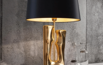
The Ceiling Sets the Tone but the Table Lamp Finishes the Conversation
The shade of the blue ceiling creates the general atmosphere in the room, yet the superimposing lighting makes the room look complete. Aartin table lamps – with their collection of hand-crafted shades in cotton and silk – are placed in a natural position with blue ceiling colouring due to their construction of complementary colour work and taken into account selections of fabric. A room with a deep navy ceiling shade and a warm-toned Aartin shade on the side table creates contrast that feels deliberate rather than accidental.
The Room Was Always Waiting for the Right Light
Changing a ceiling shade takes minutes. Living with the wrong one lasts years. Choosing well — starting with colour — is the smallest change that makes the biggest difference.